REBORN FARMS
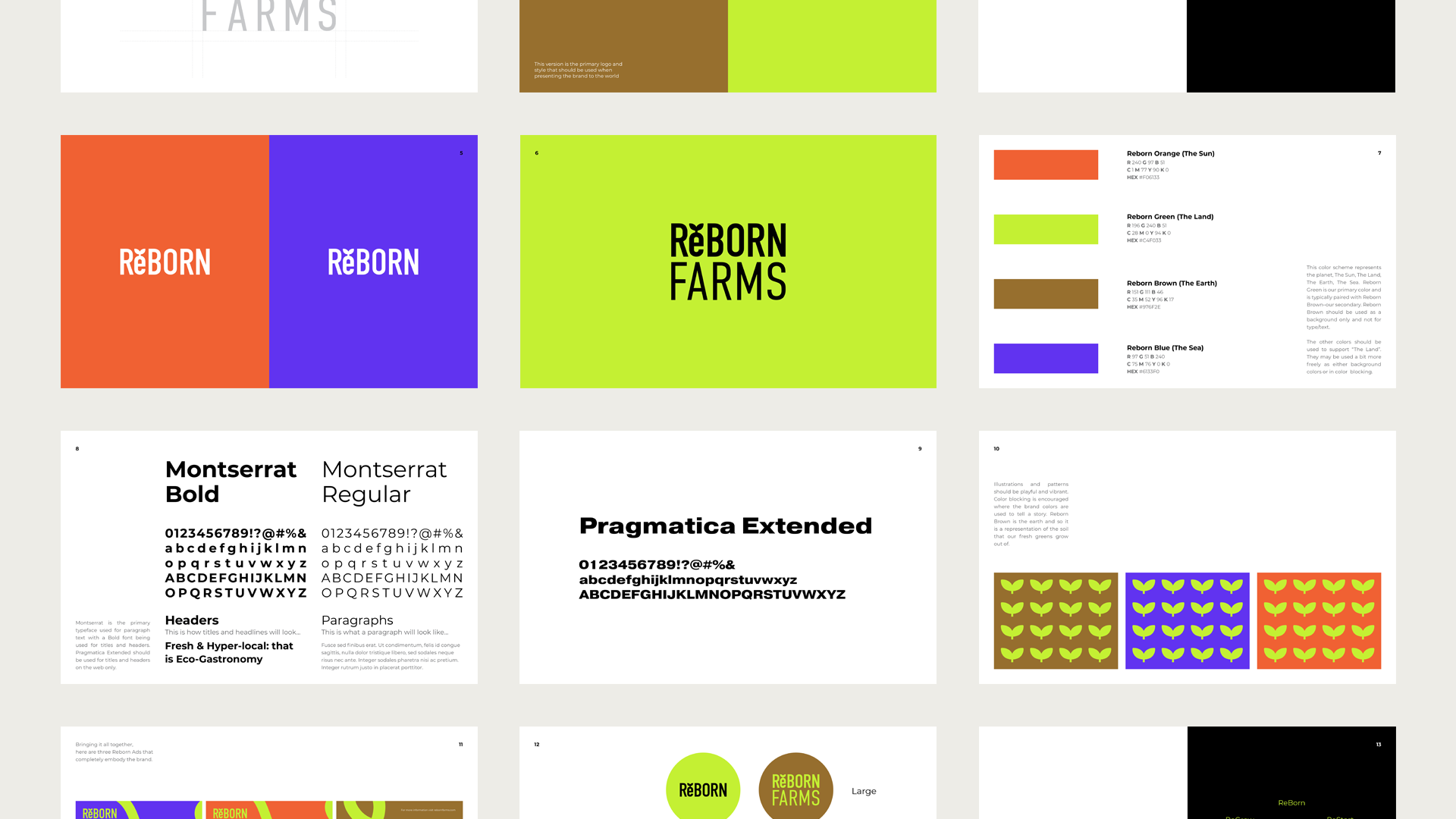
ReBORN FARMS tackles food insecurity in the South Bronx by creating access to nutritional food, pathways to economic equity, and education. We developed and designed their brand identity and logo.
WORK / Branding – Logo Design – Marketing & Advertising Design
CLIENT INDUSTRY / Agro-Tech
YEAR / 2022

As an early-stage startup, ReBORN FARMS required a unique logo and brand identity to set itself apart from others in agro-tech. We helped them to achieve this by developing and defining a color palette, brand typography, and guidelines. ReBORN FARMS represents renewal in the South Bronx where there has been food insecurity historically. They seek to eradicate this problem through urban farming, education, and tech. Inspired by this mission and revolutionary work, we developed a color palette that is a modern take on earthy colors and brand typography that is bold. The logo also connects back to the mission and the belief that food sovereignty requires a new circular economy where resources are not only recycled and reintegrated but also reclaimed and reprogrammed–ReBORN FARMS calls this the “Re” economy.


