
REMATRIATION RD
Rematriation RD is an initiative supporting Dominicans in the diaspora as they return home with purpose—to reconnect, contribute, and heal. We developed their brand identity, including the logo, typography, colors, and icons, creating a visual language that reflects their mission of cultural preservation and community growth.
WORK / Brand Identity – Logo Design
CLIENT INDUSTRY / Community Development
YEAR / 2024
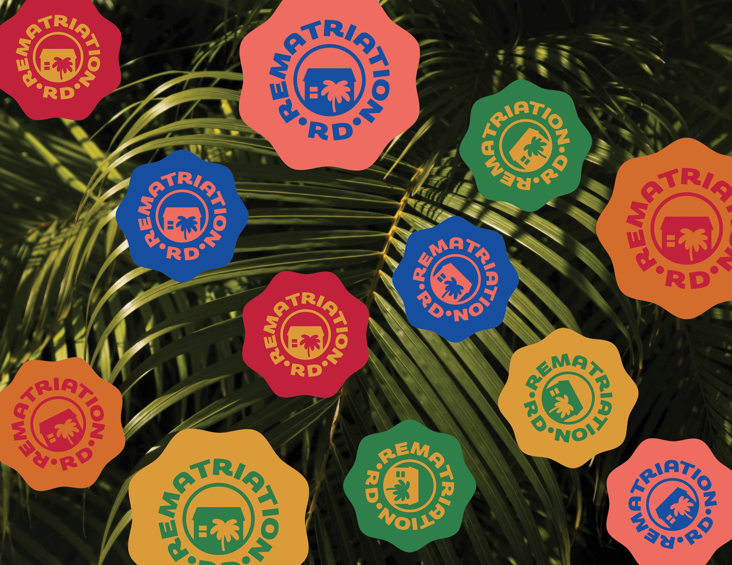
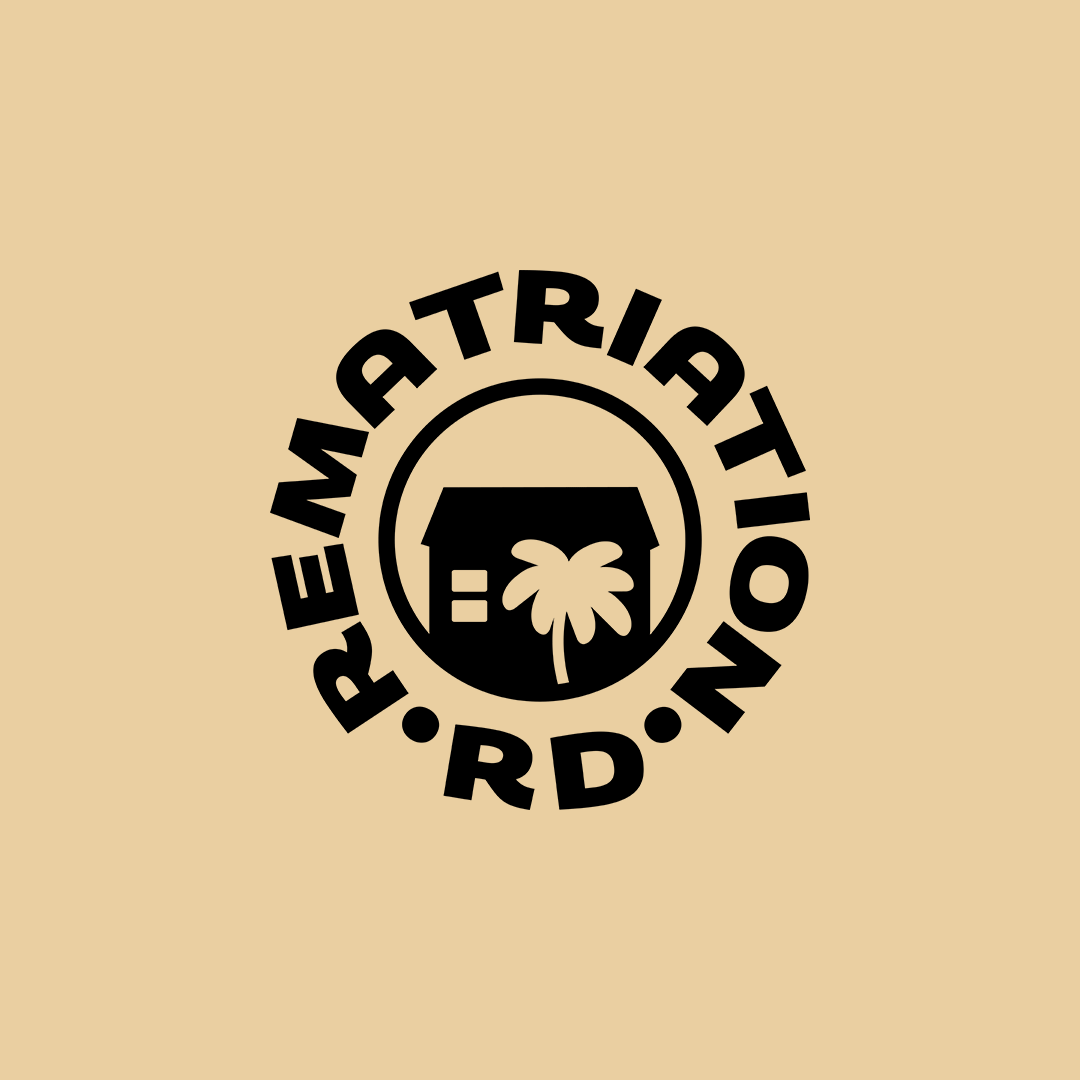
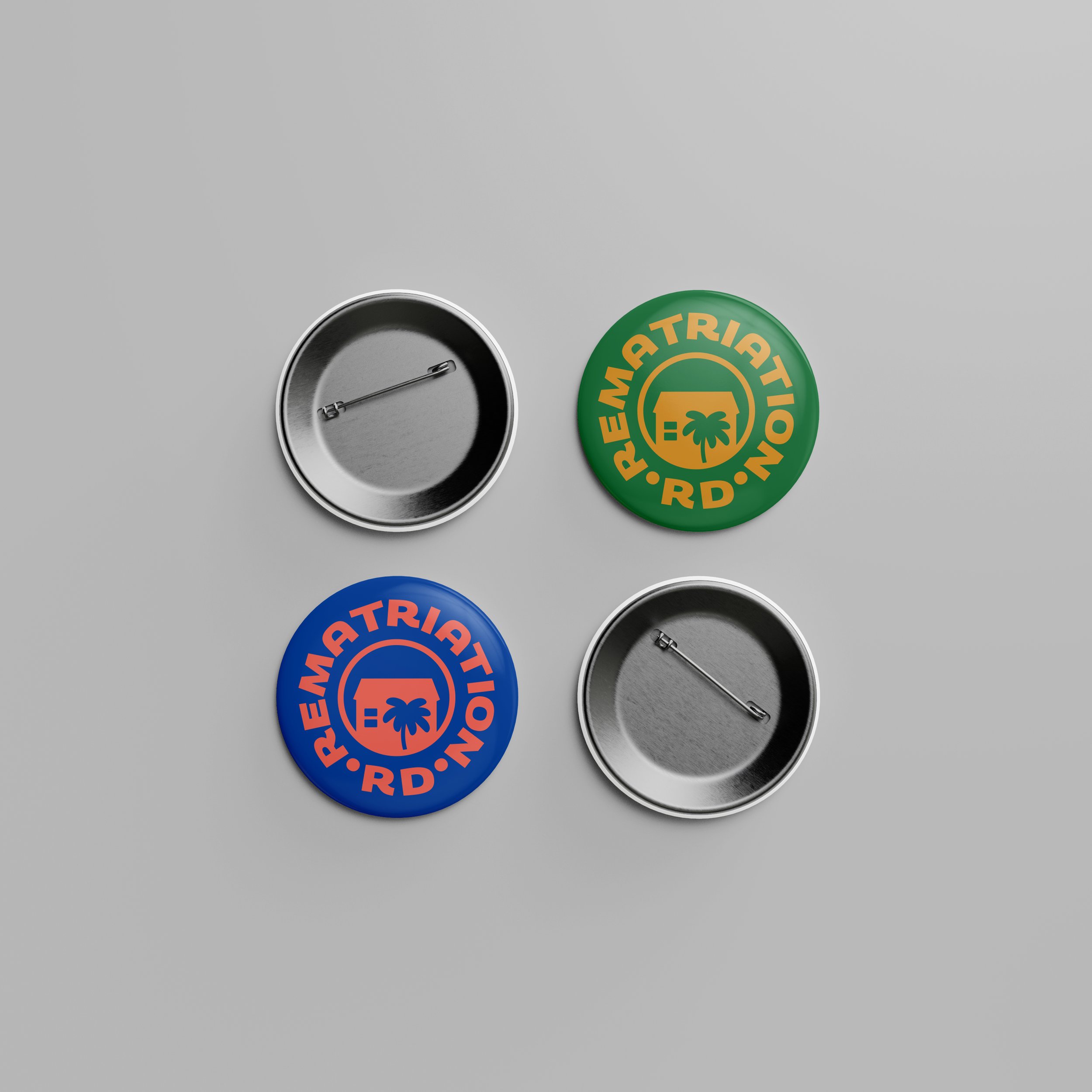
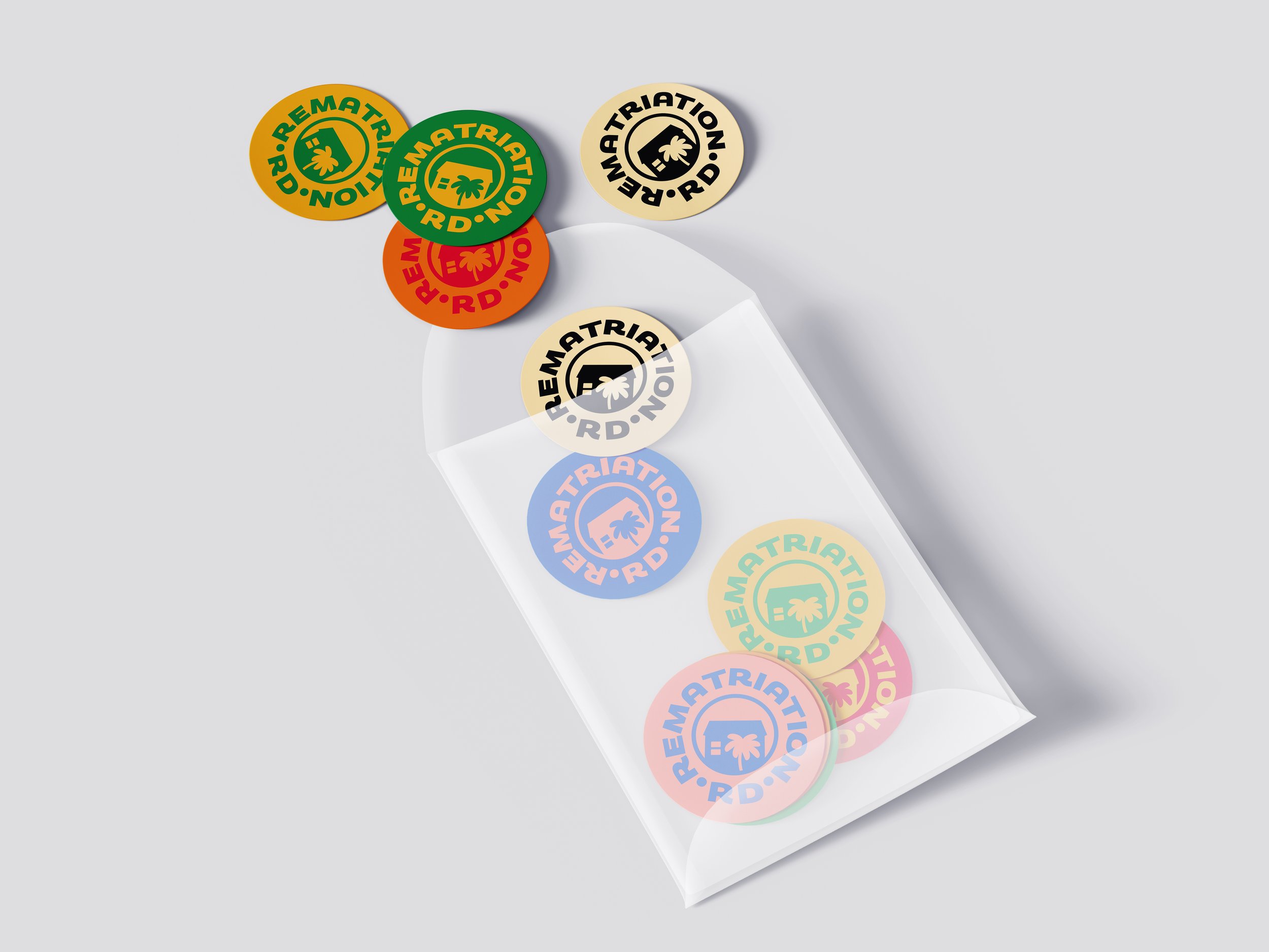
For Rematriation RD’s brand identity, we took a cultural and hyper-local approach, designing a logo inspired by a stamp of approval—something that could translate seamlessly to merchandise and retreat mementos. The logo features a Casa de Campo, a traditional Dominican countryside home, with a palm tree beside it, symbolizing rootedness and the simplicity of island life. The primary font, Kodchasan, with its open, rounded letterforms, evokes warmth and inclusivity, while a set of custom icons was created to communicate elements of Dominican heritage and land connection, telling a visual story that words often cannot.
This project was especially meaningful to us, as it reflects a larger movement to protect Dominican land and culture amidst privatization and displacement. Our founder, as a Dominican, felt a personal connection to supporting Rematriation RD’s work of creating spaces for healing and reconnection. Helping to build a brand that empowers Dominicans across the diaspora to reclaim their roots and contribute to a more just and equitable future was an honor, and we’re proud to have played a part in their journey home.


